


This deep dive tutorial will include:
- What is a Burndown Chart?
- How to Use Burndown in a Sprint
- Tips for Improving Your Burndowns
- Tracking Releases with Burndowns and Burnups
The Basics: What is a Burndown Chart?
Burndown charts offer a visual answer to the often asked question, “Will we be done in time?”
In a standard Burndown chart, the vertical axis tracks the work to be done, while the horizontal axis tracks time. In Agile teams, time is typically the duration of the time box (Sprint, Iteration, PI, Release, etc.).
The chart shows two lines: the ideal (planned) time work-to-time and the actual work-to-time. In an ideal case, as work is completed in the Sprint, the actual progress line moves diagonally down the chart in parallel with the plan. Eventually the actual line reaches zero as there is no work left to do and the Sprint is complete.
The difference in trajectory between the ideal and actual lines serve as a leading metric — an early warning system — for the team. If your actual work completed line is well above the ideal line, then you’re in danger of not completing all the work before time runs out.
Of course, not every Sprint follows the ideal path. However this isn’t necessarily the fault of the team missing deadlines. Some common challenges with effective Burndowns include:
- Poor granularity in task definition
- Progress data is not updated frequently enough
- Failure to use the data as the basis for Inspect & Adapt
While some of these problems have obvious fixes, others require more consideration. We’ll cover some of that below.
How to Use a Burndown Chart
Let’s walk through a scenario. We’ll take a fictional Scrum Team, The Radiators, through a Sprint and see how they use their Burndown chart to supplement their Sprint Backlog and use it to help them inspect and adapt towards their Sprint Goal.
Sprint Planning, Day 1: The Radiators are completing Sprint Planning and are creating their Burndown chart as part of updating their Sprint Backlog.
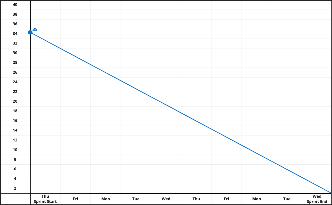
The team is taking on six Product Backlog Items (PBI) in this Sprint. During the How part of Sprint Planning (see our article secrets of effective Sprint Planning) , they broke those six PBI into 35 tasks.
They count up the left side of the Burndown chart, put a big circle between 34 and 36 and write in “35”. Then they create their “ideal” line from Sprint start to Sprint end, ten business days later. A quick calculation tells them they would need to complete, on average, 3.5 tasks a day to complete all the work in the Sprint timebox. With five members on the team, that should be no problem.
Sprint Planning is done and the team heads off to start working.
Friday, Day 2 – First Daily Scrum: It’s Friday morning, the first Daily Scrum of the Sprint. As a planning meeting, the Radiators use the Daily Scrum to ask the question “How are we doing towards the Sprint Goal, and what do we need to change, if anything, in order to meet it.” (See our tips on good Daily Scrum here.)
Sprint Planning replaces the Daily Scrum on the first day of the Sprint (Thursday) so this is the first data point for the team’s Burndown:
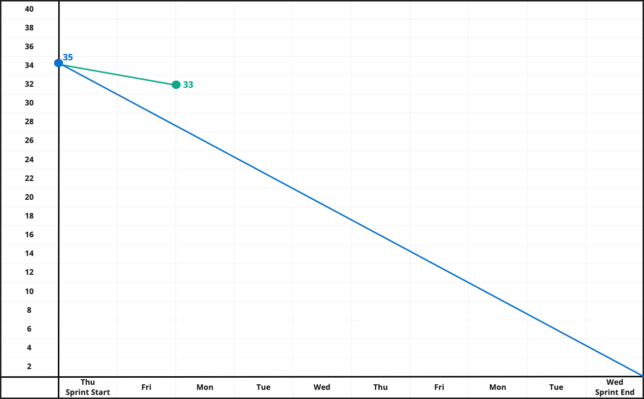
Walking the Sprint Backlog (aka Task Board), the Radiators find they have completed two tasks out of 35. They update the Burndown chart with a green marker, to represent completed tasks. They are not worried that the green “actual” line is well off the blue “ideal” line. Yesterday was Sprint Planning so they didn’t expect to get as many tasks done.
Wednesday, Day 5: We jump to Wednesday and check in with how the Radiators are doing.
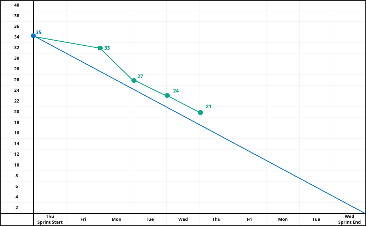
Since Friday, they have completed 13 tasks, leaving 21 remaining. They are still above their “ideal” line so the team reflects on how this is impacting their ability to meet the Sprint Goal. One of the tasks has been open since Friday and the team agrees to swarm on the task and let the Product Owner know tomorrow if the PBI related to the task is at risk.
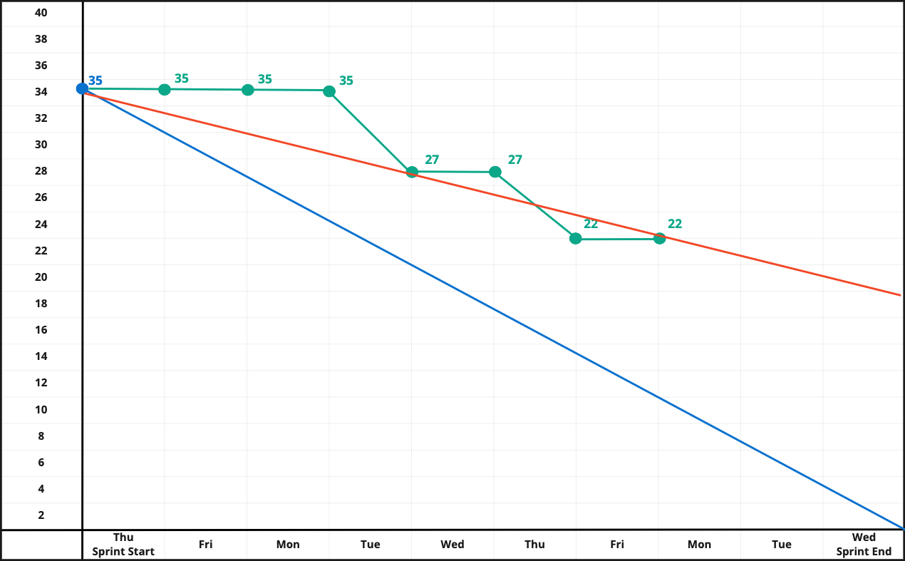
Friday, Day 7: Jumping forward two days to the end of the work week.
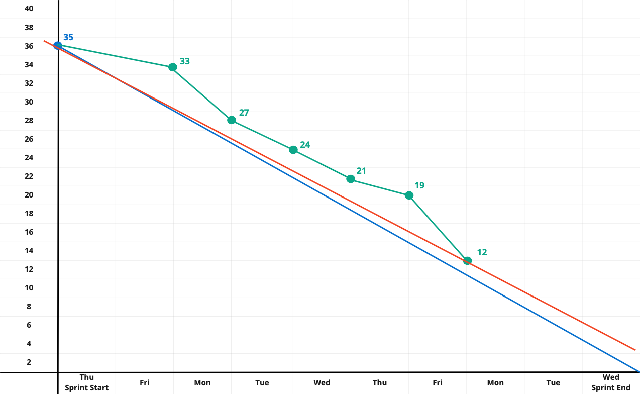
The Radiators had a really good day. The previous days’ swarming made up a lot of lost ground, closing out seven tasks. Three PBIs are now complete and two others are in process. With only three days left in the Sprint, and one of those effectively taken up with the Sprint Review and Sprint Retrospective, the team is taking a hard look at the remaining work.
Laying a ruler across the Burndown – the red line in the picture – the team confirms that, despite a great day, the trend says they won’t get all the work completed. After talking with the Product Owner, they agree to remove the last PBI in the Sprint Backlog. They’d already put it last, as it was the least impactful to the Sprint Goal and the Product Owner is even questioning if this PBI still needs to be built.
They remove the PBI from the Sprint Backlog and update the Burndown chart, as seen in the following chart.
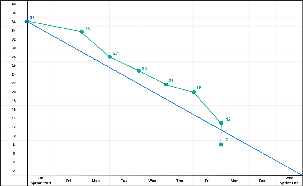
The last PBI had 5 tasks in it. After removing these five tasks from the Burndown chart, there are 7 tasks – and two PBI – remaining in the Sprint. This is represented in the Burndown chart by a vertical line going down. Vertical lines mean that tasks were added or removed from the Burndown (and the Backlog).
Tuesday, Day 8: The last full day of the Sprint and the Radiators are buttoning everything up and getting ready for a Sprint Review dress rehearsal at the end of the day.
There is one task remaining and the team is confident in completing this before they start their dress rehearsal later in the afternoon.
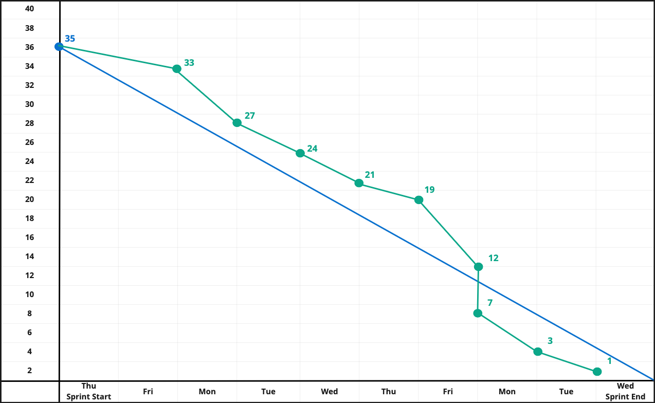
Wednesday, Last Day of the Sprint: The team’s working agreement is no Daily Scrum on the first and last day of the Sprint. Instead the team reviews the Burndown at their dress rehearsal, the evening before.
Zero tasks, all work has been completed and the Product Owner and the Developers will be showing five increments in the Sprint Review.
7 Tips to Improve Burndown Charts
Here are seven tips for improving the quality of the data that goes into your Burndown:
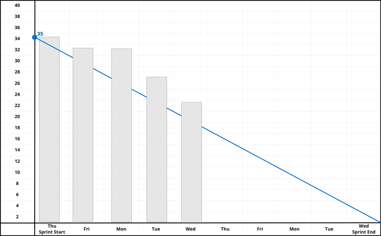
1. Tracks with Tasks for Sprints: For the vast majority of teams, a single Product Backlog Item will take several days. If the team only tracks at the Product Backlog Item (commonly called User Stories), they won’t have the granularity to see progress and projections for being done will be off.
Look at this example that tracks PBI instead of Sprint Tasks:
This is showing the same Sprint we just reviewed above, only it’s tracking the Burndown using Story Points. The first PBI completed was 8 points and took 3 days to complete. The second PBI was 5 points and took 5 days to complete (the first task was started on Friday). If you look at the red “when will we be done” line, it is well beyond the end of the Sprint and not an accurate measure of actual task work being completed.
2. Still pay attention to outcome: While tracking by tasks will help the team to answer the question of “when will we be done with all the work” that is output not outcome and it is important to not lose sight of the outcome. For example, a team has 10 PBI, each with 10 tasks. If the team completed 89 tasks they could potentially not complete any PBI, with one Task remaining for each PBI.
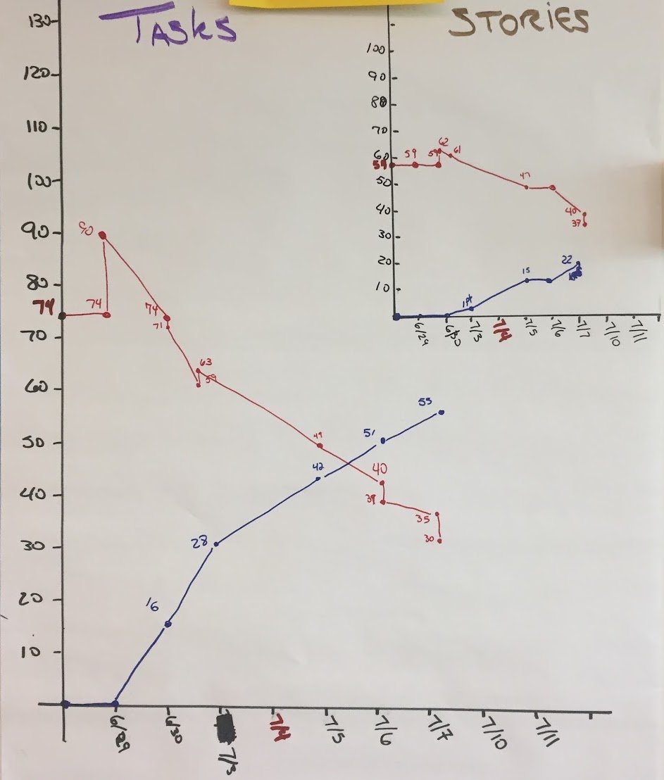
This is a Burndown from a team I worked with. You can see that while the team was tracking total tasks, as a primary focus, they also had a burndown for their stories (PBI). This allowed them to keep an eye on the outcome while focusing on getting the work done.
3. Keep the Tasks small: The most common challenge with Burndowns is variability. If one task takes three days to complete and another one hour, the Burndown is less effective for prediction because you don’t know how big each individual task is. You could have only four tasks remaining, which looks great, only to find those four tasks all take a week.
The solution is to break your work down so there is less variability. The guideline I recommend is that each task should be able to be completed in a single working day. Because team members do not spend all eight hours jamming away on keyboards, a “working day” equates to roughly four hours. During Sprint Planning the team uses the one “working day” as a way to evaluate if a task is too big.
There is an added benefit of four- hour tasks:. If a task is in progress for more than a couple of days, it serves as a visual indicator that there might be a problem and allows the Developers to focus on it during the Daily Scrum.
Note: This is not advocating assigning detailed hours to your tasks. The one “working day” leverages the principles of relative estimation, by giving the team a known reference point to compare against – a working day is a pretty well understood reference point.
4. Answering, “Are we going to get it all done?”: As we saw in Day 7 of the example, you can easily use a Burndown to answer “Will we be done by the end of the Sprint?” With a physical or digital burndown, just get a straight line and connect the starting number of tasks with the most current data point and then extend it to the right. This will give you a simple check on where the team is in completing all the work.
There is a whole rabbit warren of deeper concepts you can travel down here, including best and worst case simulations. Start simple, explore the rabbit holes later.
5. Don’t put in weekends: If you are building your own chart — be it physical or spreadsheet — don’t put in the weekends. No work is supposed to be done on the weekends and they end up being horizontal lines that make predictions harder and can make it look like the team is not productive to the untrained eye. It can also encourage working on the weekends, which is not sustainable nor desirable.
6. Bar Chart Burndowns: Some of the software tools for tracking Agile projects use bar charts instead of line graphs for their burndowns. These can quickly get confusing and hard to read.
If your tool does this, consider making a Burndown in a spreadsheet where you have more control. Don’t let your Agile be dictated by a tool.
7. When the Tool Wants Hours: There are many software tools that Agile teams can use (or are forced to use) to manage their information (e.g. Jira, Azure, Rally, Trello, etc). Nearly all these tools provide an automatic burndown function. However, some of them still insist on tracking tasks by hours, imagining that the team will assign the number of hours it will take to do the work and then daily update hours worked. This also means the Burndown displays in hours, not number of tasks. This is broken and wrong for so many reasons I am not going to go into here. This article is about making burndowns successful.
If a tool wants you to assign hours to tasks, just make every task an hour long. The Burndown will then reflect the number of tasks because one task equals one hour. Problem solved.
What About Burnup Charts?
Burnup charts show the same data that Burndown charts do, expressed differently, and are better suited for reporting up and out and for longer timescales. Instead of data moving from upper left to lower right, the data moves from lower left to upper right.
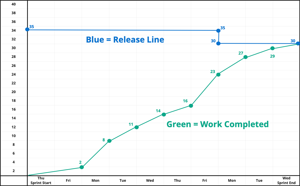
I most often see Burnup charts used for tracking larger time boxes such as a release or Program Increment. I’ve found that senior leaders get less confused by the Burnup chart as it shows a direct upwards progression for work. Instead of the burn line showing scope being added or removed, the release line adjusts to reflect the current scope. Burnup charts lend themselves well to forecasting out possible scenarios. A great example of this can be found about halfway through Henrick Kniberg’s Product Owner in a Nutshell video.
I do not recommend using the Burnup Chart for daily tracking of Sprint progress.
Burndown Charts, a Key Information Radiator for Your Team
I hope this tutorial has removed some of the mystery from this valuable tool. A well maintained Burndown chart can help any team to easily inspect and adapt towards whatever goal they are working towards.