


Ahead of the stable release of Android 14, Google is updating the Android branding and giving us a new logo with a capital A. Moreover, this new branding is accompanied by an updated 3D avatar of the Android robot, which looks more adorable than ever before. That said, here is everything you need to know about Android’s brand new look and mascot.
Android Logo Gets a Minor Rebrand
The first thing you would have noticed is that the branding is moving from “android” to “Android” with the latest change. Google is now using a capital “A” in the Android logo. Why, you ask? The company believes that the capital A will add “more weight to its appearance when placed next to Google’s logo.”
Basically, instead of having its own individual identity, the new Android logo is now aligned with the Google logo’s design language. The company wants a cohesive identity. And it wants people to know that Android, though open-source, is owned and operated by them. The same is echoed in the blog post, which mentions that the new bold Android branding “will better communicate the relationship between Android devices and the Google apps and services people already know.”
The Android logo is receiving a facelift after nearly four years. Back in 2019, with the release of Android 10, Google updated the Android branding with an all-lowercase logo and a persistent (but flat) robot alongside the branding. It has appeared on the boot screen of every Android device launched since. Now, that’s set to change with Android 14, but there’s another upgrade in store.
In addition to the logo, Google is giving bugdroid, the Android robot, an entirely new look and a full-body appearance. As shown in the image below, the robot has gone from a bland 2D logo to an adorable and curvy robot with character. Google believes that Android’s new 3D mascot “can easily transition between digital and real-life environments.”
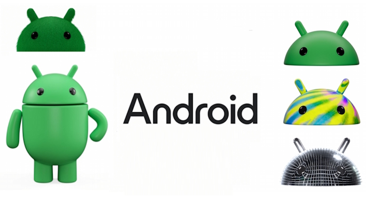
“Our new visuals draw inspiration from Material design to complement the Google brand palette, as well as be adaptable,” says Jason Fournier, director of Android consumer brand management, in an official blog post. That’s the reason we see the 3D mascot for Android painted in different colors in the official material. It’s in line with the colorful and adaptable material theming feature we see on Android phones today.
Google confirms that Android’s new logo and 3D mascot will reach Android devices this year itself. So, the all-lowercase Android logo is going to be phased out very soon, possibly with the launch of Android 14 later this month.


