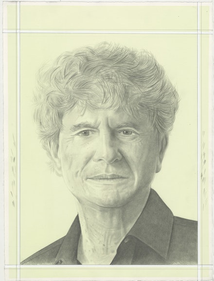
Art In Conversation
Tony Bechara with Phong H. Bui
On View
Lisson GalleryJanuary 11–February 17, 2024
New York
If the notion of privilege depends solely on our origins, what then shapes our directions, from which our lifelong vocation follows, remains a mystery. For many the mere drive towards the season of fruitage requires a singular focus on what they make as personal gestures that substitute as merits for their creations. For others, the distance between the private and the public is an unbridgeable chasm that becomes the pretext which dictates how they live their lives. We all know how delicate this balance can be. There are those who must follow their hermetic lives, protecting their solitude to make the work they desire, and those who possess both pleasures: of being solitary in the studio and social in one's cultural life.
As a personal confession, for the longest time it has been difficult to maintain the fragility of this balance between what I do on a public front: from being a publisher of the Rail while curating, writing, and perpetually contributing to many institutions and nonprofits I am deeply involved with; and the need to nurture my private sphere as an artist. It was indeed during the Trump presidency and the pandemic that such boundaries, which had consumed much of my doubt and belief in what I do on both fronts ever since the Rail was founded in October 2000, were eliminated. In full disclosure, it was true that I had forged friendships with many during this period, more than I had in the last decade, but it was Tony Bechara’s clarity and philosophy of life that had a significant impact on how I see mine. My friendship with Tony was tightened partly because of our shared history. We’re both invested board members of Agnes Gund’s legendary Studio in a School; with Tony being philanthropist/cultural worker extraordinaire, from being a beloved board of trustee of many institutions, including BAM, Museo del Barrio, and the Brooklyn Rail, to having advocated for the visibility and credibility of many artists he had championed for years such as Carmen Herrera, Leon Polk Smith, among countless other overlooked artists, I try to do the same with the Rail as platform from which many artists journeys are shared in great depth. We’re both immigrants—he was born in San Juan, Puerto Rico, and I in Hue, Vietnam. And lastly, with luck and reverie, I’m grateful to Tony for his clear path that has inspired me to love my own. On the occasion of Tony’s one-person exhibit at Lisson Gallery, I paid a lengthy and pleasurable visit to his studio near Union Square to talk about his life and work. The following is an edited version for your reading pleasure.

Phong H. Bui (Rail): In knowing the complex, interesting and long journey you have taken, born in San Juan, Puerto Rico, from an educated business family: your mother Rosa Martinez Vicens, her side has roots in Majorca, Spain, and your father Francisco Bechara, in Beirut, Lebanon; from having studied at Georgetown University both as an undergrad and grad student, for two years at Sorbonne University, only to return to study two more years at NYU. Can you first share with us such a history? How did all those experiences arrive at an apex of clarity, from which your pursuit to be an artist was determined?
Tony Bechara: It’s true that I have an unusual history, including deep roots in Mediterranean culture, but I was born in San Juan, Puerto Rico, where I grew up for most of my youth, and my family is still there. I went to early school in San Juan, before my parents sent me to prep school in the states at the New York Military Academy. Francis Ford Coppola, Fairleigh Dickinson Jr., Stephen Sondheim, and unfortunately Donald J. Trump, are among those who have also gone there. My parents then sent me to study philosophy and economics as an undergrad, then studying law afterward at Georgetown University, too many schools I am afraid, partly because my parents would not send me money unless I was in a proper school. They deeply admire artists but didn’t believe I could make a living being an artist. Instead they wanted me to get a BA in business, then a law degree, then go back and work for the family’s business.
Rail: The usual story, of course! What next?
Bechara: I knew at some point that I didn’t want to become a lawyer, so I left at the tail end, then somehow I was able to convince my parents to let me go to study French history for two years at the Sorbonne, then spending a year traveling extensively in Spain, Italy, and elsewhere in Europe to see art at various museums, architectural landmarks, and so on. Then I was encouraged to return to New York City to attend another grad school for International Relations at NYU, while at the same time, due to what I was exposed to during my travels in Europe, I began making figurative paintings at night and on weekends while thinking the whole time about the prospect of being an artist.
Rail: Which was what compelled you to enroll at SVA (School of Visual Arts) between 1967 to 69?
Bechara: Yes, for two years, and it was an incredible place at that time. One on hand, I was studying under photorealist painters like Joseph Raffael, Malcolm Morley; Pop artists like Steve Gianakos; abstract artists like Robert Mangold and Raymond Hendler; I was also taking anatomy classes with Burne Hogarth, the illustrator of Tarzan comic strips, and an amazing art history/critique class with Lucy Lippard. On the other hand, there were visiting artists like Richard Serra, Robert Ryman, Brice Marden, and others, who were Minimalist and Post-Minimalist artists, and they too had an impact on my early thinking. And then I took classes with a few among the third generation Ab Ex painters like Michael Lowe, Norman Bluhm, Michael Goldberg, just to name a few. It was very exciting in all, partly because it was during this period that I underwent a tremendous change in my work—from being a figurative painter to an abstract painter. I mean I was making paintings of the figures in landscapes, painted in a chromatic palette of black and white, from multiple perspectives, referencing everything cinema, from cinematic angle, cinematic feeling to cinematic power rather than the way we would pictorially paint in describing a narrative in painting. In any case, those paintings were made in part because I was interested in neorealist films, new wave films, social realist films, which were mostly shot in black and white, documentary-like structure in order to capture the poverty, the rawness of what was happening in the post-WWII period, from the forties leading to the sixties, often made on locations with non-professional actors, or mixing up professionals and non-professionals together in their castings, from Vittorio De Sica’s Bicycle Thieves (1948), Giuseppe De Santis’s Bitter Rice (1949), Ingmar Bergman’s Wild Strawberries (1957), Juan Antonio Bardem’s Death of a Cyclist (1955), as well as other now-classics films by Nasiga Ōshima, Yasujirō Ozu, especially Satyajit Ray—
Rail: Whose life was changed by Jean Renoir when his 1951 The River was being filmed in Calcutta. It was Ray who helped Renoir in location scouting. And prior to meeting Renoir, Ray was a young local ad executive, a book-cover designer, and a lover of cinema. Having spent some time with the master, Ray decided to pursue filmmaking as a lifelong vocation.
Bechara: That’s right. I, too, thought of becoming a filmmaker, but I realized it would require collaborating with countless people and a long production, etc., etc. After having spent time alone seeing works of art in various museums in Europe, especially the experience of seeing the mosaic masterpieces at the various sites in Ravenna, Basilica di San Vitale, Basilica di Sant’Apollinare Nuovo, or Mausoleo di Galla Placidia, for example, then having seen the ornamental calligraphy, filled with amazing cursive and kufic writings, and the tile patterns at Alhambra in Granada, all of which were made with such precise geometrical calculations, and the facts that they were hybrid styles, blending characteristics from both Western and Eastern influences in architectural motif and design, and so on, had made me realize how much I appreciate my solitude and how the hand labor of making things became so apparent that a life devoted to being a painter was far more appealing than being a filmmaker.
Rail: Super understandable indeed. Were you able to transform those experiences into what you were making while you were a student at SVA?
Bechara: Not until the second year. The first year was a great struggle in trying to figure out how to make paintings with figurative elements and gestural abstraction. I should add I was working as an assistant to Philip Pavia, an Ab Ex sculptor and the founder of the Club, on the weekend, as well as bartending every Friday evening at the second version of the Club, which Philip was trying to recreate on eighth floor of a building on Broadway and 13th Street, not far from his studio, next door to Grace Church, where he would walk to work from his home on Great Jones Street.
Rail: As Philip, in my interview with him for the Rail’s February/March issue in 2001, told me the Club really got started in the late fall of 1948, which was a significant year in that de Kooning had his first one-man exhibit of the “Black and White” paintings at Charles Egan in April; Gorky died three months later. In fact, the Club, which was founded right across from Hans Hoffman’s school, began its first gathering with a memorial panel for Gorky, which went on operating for a good seven years until 1955, then the leadership was passed on to our late friend Irving Sandler, who ran it for another eight years, from 1956 to 1962.
Bechara: Exactly! For having also published It Is magazine, even though there were only six issues in its seven years of existence (Spring 1958 to Autumn 1965), it was very influential. Philip had wanted to restart the Club again around 1967, which lasted maybe only two years. It was wonderful, but those that came were mostly artists from the second and third Ab Ex generations, including Milton Resnick, Alfred Leslie, Elaine de Kooning, Pat Passlof, Michael Goldberg, among others. Still, I learned so much about their struggles, the art they each made, and their community. I also enjoyed all the dramas, including one incident when two or more got into a fight, then all the sudden the music was turned on, then everyone rushed to the floor dancing with joy.
Rail: [Laughter] Okay, but how the hell did you manage going to school at SVA full-time, working on the weekend for Philip, plus bartending every Friday night at the Club, while keeping up with schoolwork, never mind making a breakthrough in your work, and so on?

Bechara: When you’re young, if you feel inspired enough by someone else, depending how open you are, sleep was never a problem, because I was so excited about everything. I was so curious about what was going on in the New York art world at the time.
Rail: 1967, the year you returned from France, which was the height of the Civil Rights Movement, the national protest against the war in Vietnam, and interestingly it was the very year, among other social unrests, Artforum moved from LA to New York, with Philip Leider, being the chief editor at the time, and its inaugural issue in New York, featured three important essays, Michael Fried’s “Art and Objecthood,” Robert Morris’s “Notes on Sculpture,” and Sol Lewitt’s “Paragraphs on Conceptual Art.”
Bechara: I remember them all, of course.
Rail: Which essentially added fuel to the ongoing and intense debate between Formalism and Minimalism. But as we all know, it was sculpture that dominated the art world—painting was put on the back burner, which precipitated the first claim of “the death of painting.” What were your feelings at the time?
Bechara: My feeling was it was silly, even though the ones who joined this claim were very aggressive. Some of my professors did rally after this claim. For they told me painting is dead and should be dead. I also remember in my response to them very clearly that maybe that’s why I’m interested in it, because everyone thinks it’s dead. As long as there are color pigments, and the fact that no technology ever can substitute this old practice, which has existed since cave paintings, way before language and the written words were invented, painting culture will always be with us.
Rail: Amen.
Bechara: As I said earlier, SVA was an incredible place in those days. I remember how, by absorbing all the challenging yet useful criticism from my professors, I was able to reconnect to my eureka moment of having been moved by seeing those mosaic masterpieces at the various sites in Ravenna, and Alhambra in Granada, as well as Baroque painting and architecture, including Titian’s Assumption of the Virgin (1516–18) in the Basilica di Santa Maria dei Frari, or say Tintoretto’s Miracle of the Slave (1548) at Gallerie dell’Accademia in Venice, both of which in some ways are very similar in so far as the energy is equally dispersed instead of creating a hierarchical structure, from which the focus of our viewing experience is predetermined. Everything I saw on this trip rushed back as a culminating point that led me on a route to the universe of pixelation that I’m doing now except then it wasn’t called “pixelated pixel” then.
Rail: This was when your golden grid was deployed.
Bechara: Yes, as I’d said, it was in the middle of my second year at SVA, which was also at the same time when I became so fascinated with color, and the mixing of color which soon led to my interest in different optical effects, that in turn led to the psychology of color, then ultimately gave way to my obsession with color theory, from Isaac Newton’s color wheel, including red, orange, yellow, green, blue, indigo, and violet reflected onto the wall through a glass prism, as demonstrated in his book Opticks (1704), to say Johann Wolfgang von Goethe’s Theory of Colours (1810) which made some adjustment to Newton’s theory, especially with the new phenomena such as colored shadows, refraction, chromatic aberration.

Rail: One can say while Newtonian theory of color is more scientific based, Goethean theory includes emotional responses to colors.
Bechara: That’s right. Also, I spent lots of time looking at pointillist paintings by Georges Seurat, Paul Signac, Henri-Edmond Cross, while continuing to read other books on color, including Michel Eugène Chevreul’s classic The Law of Simultaneous Color Contrast (1839), Richard Paul Lohse’s New Design in Exhibitions (1953), Johannes Itten’s The Elements of Color (1961), and Josef Albers’s Interaction of Color (1963).
Rail: The latter two taught at the Bauhaus.
Bechara: Exactly, although in Itten’s work there’s an affinity to mysticism, which became a conflict with Walter Gropius who wanted the Bauhaus focusing on making objects for mass production.
Rail: Holy cow Tony! You really have your interest in color under your thumb. My question now is how does each painting get made, where does it begin?
Bechara: For every painting, I first use the one-quarter inch masking tape to create the grid, dividing the surface across equally. There are four stages of taping. It begins with taping one layer on the whole canvas vertically, then proceeds the same horizontally. The next thing is to apply the selected color with a small brush, then remove the tape. Repeat this same process on the unpainted squares one more time vertically, then horizontally, then apply the last layer of colors. What I love is the degrees of surprise every time; to take each layer of tape off the canvas is to reveal new worlds of optical symphony.
Rail: And each painting is painted with acrylic, not oil, on raw or unprimed linen, am I right?
Bechara: Yes, because oil, which I love, takes too long to dry, and it doesn’t react well to being covered and uncovered by masking tape. Whereas with acrylics, each layer can dry overnight, while remaining very resilient. As far as how the selection of colors is chosen, each is determined by certain groups of colors I have painted already in my sketch book, which I have hundreds of by this point. I should also add that despite the popularity of William C. Seitz’s exhibit The Responsive Eye at MoMA in 1965, Op art was never treated very kindly by many New York intellectuals like Tom Hess and Harold Rosenberg who hated it. Hess referred to it as a “chronic international disease” and Rosenberg called it the “Premature Echo,” for example.
Rail: The exhibit caused the then New York Times chief art critic John Canaday to write an overwhelmingly positive review, and Mike Wallace responded similarly in his TV show at the time.
Bechara: And it’s true that many artists in that show are being reconsidered in the past few years, including Max Bill from Switzerland, Bridget Riley from England, Piero Dorazio from Italy, Julian Stanczak from Poland, Victor Vasarely from Hungary, both Carlos Cruz-Diez and Jesús Rafael Soto were from Venezuela, among many others. It was a world-wide phenomenon to say the least for those who were fascinated by the psychology of optics, by the neurological reactions to colors, and how colors affect us physically and emotionally. There’s no need to defend it now, but essentially The Responsive Eye was an international exhibit and New York was not ready for when it was shown at that time. To prove the point, in 2016, Jorge Daniel Veneciano, the former director of El Museo del Barrio, curated an exhibit response to The Responsive Eye called The Illusive Eye, an international survey on Kinetic and Op art, which offered a broad intellectual context for Op art and geometric abstraction, one that goes against the grain of formalist art history, featuring many artists from Europe, mixing up artists from America, and Latin America, for example Ernesto Briel from Cuba; Lygia Clark from Brazil; José Pedro Costigliolo from Uruguay; Omar Rayo from Colombia, Norberto Gómez from Argentina, just to name a few.
Rail: Which garnered so many reviews, from New York Times, Observer to Artforum, and so many others. In fact, I loved seeing your work representing Puerto Rico in the exhibit. Holland Cotter praised Carmen Herrera’s “Black and White Paintings,” which overlapped with her one-person exhibit at the inaugurated Lisson Gallery in Chelsea in the same year. How would you describe your first mature paintings in reference to the grid and to color?

Bechara: It was thrilling I must say in having discovered the grid as a perpetual structure and the color “pixels” as fields of different moods, or temperatures, if you like. In some cases, certain subtle vibrations can be achieved by a monochromatic color, various shades of red in a painting entitled Red Skin, painted in 1971, which literally referred to the skin of the red color for example. In other cases, a painting entitled Carib (1982) the color selection is wider and richer in its spectrum while the scattered distribution is far more vibrant. I’d say some can be very calming while others are unpredictably wild and vivid, like Tyger Tyger (1975), which was inspired by William Blake’s famous poem “The Tyger,” which was published as part of his Songs of Experience (1794). I just love the framing of symmetry that suggests the artist himself is making sure all the proportions of his project are correct.
Rail: Do you think growing up in Puerto Rico, a tropical marine environment with unpredictable and extreme weather, which can be super dramatic, from one beautiful calming minute to a thunderous pouring rain, has some effects on how you subconsciously relate to your color sensibility?
Bechara: Definitely. Tyger Tyger is a good example, because instead of the orthogonal structure, what we see is a network of curvilinear forms bursting with kinetic energy, moving with speed outward from the central axis. While it’s true that I’ve always been mindful of how to maintain the balance between the given structure of the grid and the color selections from the outset, which refers to one side of my restrained sensibility, and the permission to welcome spontaneity, chance operation, surprise occurrence that relates to my other unrestrained side. I’ve learned to enjoy this delicate balance by trusting what the paintings ask me to carry out.
Rail: Is it fair to say that while most American Minimal artists who had deployed the grid in the sixties and seventies, whether it’s true or untrue in the direct reference to their inherent Puritanical roots, the collective aspirations as it seem was aimed towards minimal expression, whereas artists elsewhere, from Europe, Eastern Europe to Latin America, for whom the grid was simply a structure from which they each can explore differently, in different directions as we spoke in the international emergence of Op art—I mean one can think of you as a maximal Minimalist, instead of say being a draconian Minimalist.
Bechara: It’s true in both cases, but who would care about being given a label? I mean, once you’re boxed in or framed by an art historical analysis, it can be detrimental to simplistic reading of the work. Take Leon Polk Smith, for example, whose work I’ve been admiring for a longtime. In fact, my studio on 19th Street was once his studio. What I meant to say is Leon was born near Chickasha, a year later Oklahoma became the 46th state in 1907. His parents were products of Cherokee extraction. While it’s true that Leon’s early works had strong reference to Mondrian’s and De Stijl’s reductive aesthetic say in the early forties, in his mature works by the mid to the late fifties, it would be too easy to place his work in the context of his two peers say Ellsworth Kelly and Myron Stout. I’d emphatically say Leon’s personal use of flatness yet dynamism in his abstraction is undoubtedly related to Kiowa ledger drawing, tipis, not to mention the flatland of the Great Plains, among other subtle references to his early roots.
Rail: Like what your beloved Carmen Herrera once said, “[she] never saw a straight line [she] didn’t like,” perhaps Leon may have said, “I never saw a curve I didn’t like.”

Bechara: That’s right! [Laughter] I feel all artists are sensitive to where they came from, their roots, their first homes, just as much as how they adapt themselves into new environments. Carmen’s abstraction is directly related to her deep interests in asceticism and architecture, whereas in Leon’s case, the underlying explorations of identity and race in his abstraction may or may not be revealed.
Rail: Super true Tony. Can you describe your interest in entropy, randomness or disorder?
Bechara: First, while entropy as an idea which refers to the notion of randomness or disorder, if it is tied to our aesthetic responses, especially to the made objects as opposed to natural objects, then our sensual or sensory perception, including our sense of seeing, hearing, tasting, and touching—
Rail: Plus, the two lesser-known senses, vestibular and proprioception, which are connected to our sense of touch, especially the vestibular sense involves movement and balance.
Bechara: Yes, all of which led me to think that there really is no such thing as randomness. It’s just a point of view, a perspective, which led me to use the concept of randomness as a tool. Since I have the grid as a structure, I trust each painting to tell me what to do, how to be more random, or less random. It is always the surprise element that I find alluring.
Rail: So, you surrender to this process, as Georges Braque once said, “In a painting, what counts is the unexpected.”

Bechara: Yeah, it’s the randomness that I could control, what is otherwise known as controlled chaos. Do you remember Dr. Alexander Fleming, who in 1928, after having returned to his laboratory from a holiday, discovered a mold growing on a Petri dish of Staphylococcus bacteria on his desk? He immediately noticed the mold seemed to be preventing the bacteria around it from growing. He realized the mold itself created a self-defense chemical that could kill bacteria. That was how penicillin was discovered. I think that the moment, the so-called accident, is very much part of the creative process. Not only in science, but in art, among other fields. It’s proven so many times while you’re looking for A and suddenly you ended up with B, and B would lead you to C or D or F and that’s the direction that you would follow. For, in my experience, the philosophical meaning of an accident is just fascinating.
Rail: Yes, indeed, and the key work is philosophy, which means to love wisdom. At any rate, I have noticed two additional things about your work: One, you’ve painted on various configurations, from vertical, horizontal, triangle to tondo, diptych, among others—not just square, although square seems, as this exhibit indicates, to be the predominant preference. Two: most, if not all of the four sides in the small paintings, 24 by 24 by 1 ½ inches Random 28 (Red version), Random 28 (Blue version), Random 28 (Green version), and Random 28 (More Yellow version), were painted as a continuous surface, whereas in the bigger ones, 60 by 60 inches, Random 28 (Red version), Random 28 (Blue version), Random 28 (Green version), and Random 28 (More Yellow version), their sides were left unpainted. What are your thoughts on these two decisions?
Bechara: Well, it’s a matter of scale, don’t you think so?
Rail: That was my next question, in fact!
Bechara: It’s as much a pragmatic response as a psychological one in how we all can read what’s right in proportion and what looks amazing with the right scale. This is to say with the increments of one-quarter-inch squares in the grid, which is considerably small on a painted surface of 60 by 60 inches format, it therefore doesn’t require the four sides to be painted. Whereas with the small canvases, the 16 by 16 inches with the sides being 1 ½ inches, the perennial Renaissance window into which to go into another world seems trivial, so, instead, to have the painted surface continuing onto the four edges of the canvases just feels right to enhance the painting’s objecthood.

Rail: Definitely. In fact, not only the physical object-ness of the painting is enhanced, so is its tactility. In other words, the urge to hold the painting, to touch the painted surface is very strong. My late friend the great painter Thomas Nozkowski referred to this scale as “reasonable-sized painting,” which essentially implies that the urge to tuck the painting under your arm is irresistible.
Bechara: [Laughter] I should also add, in addition to the issue of scale versus proportion which we had just talked about, I must be very mindful of how the optics of color activation gets deployed. For I’d started painting in the late seventies with a strict selection of 125 colors, distributing in an infinite number of small squares, accentuating the all-over-randomization of the painted field of physical perception, which I kept making throughout for the longest time with the emphasis on discovering small eureka moment each time each layer is painted with the same process of taping, painting, and un-taping, and so on.
Rail: Which applies to the monochrome paintings as well.
Bechara: Yes, it can be a totally different visual experience in that at times our primary perceptual data can appeal to our eyes to different degrees before the specificness of color is seized upon, especially in the case of perceptual abstraction, which is far more intense, partly because it remains to be an unexplored place located between the cornea and the brain. As we know, each color has its own value, its own intensity, and chromatic implications. So, when I’m using 125 colors that exist as shades and as tints within the color wheel, it’s similarly applied with say 36 or 34 shades of cadmium red, 36 shades of magenta, 25 shades of black, not to mention the various degrees of surfaces, from matt, semi-gloss to glossy. This is to say the retinal impact of the 125-colors-palette paintings with their optical flickers, color sensations, or vibrations, and so on, would have far more loud, disorienting effect than say the monochrome paintings, which is very calming.
Rail: So, one can say while the experience in the former is akin to being in a symphony, which requires over eighty musicians, the latter is like chamber music, composed of no more than two or six musicians at the most.
Bechara: That’s a nice analogy. Yes, I do often think of music and the notion of structure or composition, which refers to a variety of organizational elements such as units of rhythm, melody, variation, or repetition.
Rail: That makes sense. As you repeat the process, painting with a small brush on each square at about two inches separation in some cases, or to three- or four-inches separation in others, say especially with the 28-color paintings, dividing between 6,000 to 7,000 pixels, how would you describe your own sense of variation as opposed to repetition?

Bechara: I should mention that the decision of making paintings with twenty-eight colors was made only in the last three years, at the beginning of the pandemic. I do relate my paintings to music, especially with twelve-tone serialism of Anton Webern and Alban Berg who led to minimalist composers like Steve Reich, Terry Riley, or Philip Glass, all of whom have deconstructed the serial tradition. By, for example, generating a variation of sounds may appear like the original musical score but is never the same, they create a repetition of a specific melody that takes the original musical score and either repeats it so that it is the same, or repeats it so that it is primarily the same but is transposed so that it starts on a different note. I also love Sufi dance, also known as the “dance of being,” which has deep roots in Islamic spiritual and mystical tradition. And often the dance is accompanied by music composed of repetitive songs and melodies, which were meant to generate an atmosphere conducive to meditation and spiritual elevation. The idea is to get the dancers carried away by the repeated movement, while at the same time focusing on their breathing and the repetition of sacred phrases.
Rail: Therefore, they would feel the dissolution of their individuality, leading to a fusion with the divine presence.
Bechara: That’s correct. This is the space and place I’d like to be, and what I make is the synthesis of all things we’ve spoken about. It’s a new beginning for me, as I realized I’ve made lots of paintings at a consistent and steady pace. It’s exciting to share them with our community, especially at this moment in time.
