Tag Archives: Alvar Aalto

finnish contemporary in france.

The Maison Louis Carré, the eponymously named home of a French art dealer and collector, was designed by master of Finnish modernist architecture (and design hero of mine), Alvar Aalto. Set in the French countryside 60km from Paris, the building and landscaped gardens were designed by Aalto in the late ‘50s, in his characteristically functional, modernist style, using natural materials and organic forms. 

A perfect backdrop, then, for the group exhibition of Finnish contemporary sculptural works by glass artist Laura Laine, textile designer Kustaa Saksi and sculptor and ceramicist Kim Simonsson. 

‘While working with different materials, the artists have a common material approach, presenting works with a three-dimensional feel that perfectly fit with the characterising organic, functionalist atmosphere of the Aalto-designed surroundings.’

There is something rather wonderful about seeing art and sculpture in a relatable, residential setting rather than the rarefied environment of a white-walled gallery. Aalto’s interiors are typically congenial and light-filled and as was his way, everything down to the light fittings, fixtures and loose furniture were Aalto designed. The house itself emerges from the French countryside, its swooping roof of blue Normandy slate imitating the surrounding landscape, evocative also of the simple form of a Finnish laavu. Walls and base of nearby Chartres limestone create a patchwork with white rendered brick and panels of timber. The pine wood continues within, adding warmth and interest against the expanses of white walls. The roof, a simple but dramatic line when viewed externally, becomes a glorious feature of the large entrance hall on the inside – timber lined, it utilises Aalto’s often used organic curves – as seen in his signature Savoy vase, with its iconic quintet of curves. Column free and with vast expanses of wall for hanging art, this space is the predominant gallery space. The adjoining living room fronts on to the expansive view, with its panorama window, and provides a more intimate domestic setting for the art.

The bespoke light fittings and fixed and moveable furnishings are evident throughout the house, including an early version of Aalto’s Golden Bell pendant light (more Aalto lighting, here), and his classic Stool 60.

Call to the Wild / L’appel de la nature 

Maison Louis Carré, 2 chemin du Saint-Sacrement, 78490 Bazoches-sur-Guyonne, France

20th of June to 29th of November 2020 (advanced booking is necessary).

Photographs: Frederik Vercruysse, with thanks.

apartment of shadow and light.

This apartment in Rome feels light and dark and shadowy, with its monochromatic palette and natural tones. The wonderfully sensual wall finish throughout is a mix of clay and aggregates – essentially refined earth – one of the beautiful, organic finishes of the Italian company Matteo Brioni.

villasciarra2villasciarra1villasciarra6villasciarra5villasciarra7

A dark grey terracotta floor, laid in herringbone pattern, adds a decorative element to the otherwise austere surfaces, as does the beamed ceiling. Raw materials are used to their best effect, the detailing bringing the refinement – a low, linear concrete ledge acts as fireplace and seat; fine metal shelves frame a library wall; a folded metal stair, with mesh panels forming the balustrade, serve their purpose without affectation.

The kitchen combines dark stone, sleek, brushed stainless steel and beautiful, metal framed ribbed glass doors, which work to soften and blur the hard working utility zone. Copper pendant lights lift the monochrome palette.

The choice of furnishings is simple – a mix of mid-century Alvar Aalto, Eames and others.

Villa Sciarra, Rome, by MORQ Architects, via Elle Decor Italia and Matteo Brioni. Photographs, Kasia Gatkowski. There are also some beautiful pictures of the apartment unfurnished, here

house of tallowwood and scandinavian simplicity.

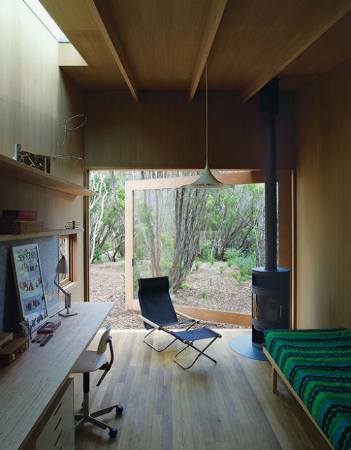
living-room_ohl.Situated in a very typical, coastal Victorian landscape of scrub and tea trees, this house is designed around a courtyard, blurring the lines between outside and in. Throughout, Japanese and Scandinavian influences are evident, from the simple, open plan layout to the beautiful detailing, influx of light, and restrained palette of textures and tones.

The L-shaped building surrounds the courtyard, with master bedroom at one end, and the children’s bedrooms at the other. Between, the open-plan living space leads out onto the terrace, partially sheltered by the overhanging roofline. In a separate pavilion, a studio and guest room is the ultimate garden room, with a fully openable window wall, wood burning stove and high-light windows.

All of the surfaces are lined with wood – a beautiful, pale, honey coloured indiginous eucalyptus called tallowwood. Exposed, laminated oregon beams form the roof structure, the lines continuing down to form a grid of shelving in the open plan living and kitchen spaces. The focal point of the living space is a free standing, dark-grey brick chimney, which contrasts beautifully with the wood; the only other contrast comes from simple white joinery and white mosaic tiled kitchen benchtop.

tallow-wood-kitchen_ohl.shiver_me_timbers-studio-wood-stoveofuro-tub-master-bath_ohl.beds_ohl

Everywhere, fully retractable windows open rooms up to the outside, with clerestory windows bringing even more light in. The simplicity of the design is underpinned by the simple lines of the Scandinavian furniture – Alvar Aalto daybed and stools, Hans Wegner Wishbone chairs, Nanna Ditzel hanging rattan chair and Marimekko textiles. The perfect weekender.

Pirates Bay House, O’Connor + Houle. Photographs, Richard Powers.
Via Interiors we Love, dwell.com

stockholm modern.

Within such an elegantly ornate interior, the bold mix of contemporary art and Scandinavian design classics creates a tension that feels utterly harmonious in this Stockholm apartment.

In the wood-panelled office, pale, angular furniture with simple, masculine forms counter balance the intensely decorative interior. Textures contrast wildly, too: rich, honey-coloured woodwork and an emerald green marble fireplace neither over-power nor dominate with a contemporary shaggy rug to soften the effect.

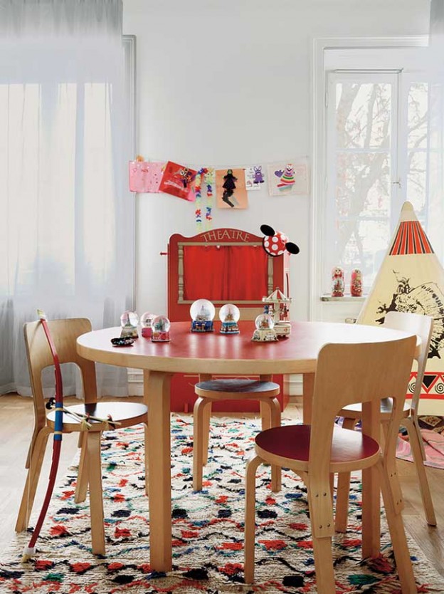
Classic furniture pieces feature throughout, including 1930s Artek chairs and a coffee table by Poul Kjaerholm. Other iconic Alvar Aalto pieces can be found in the children’s room; the Artek Chair 66, and Table 90A. I love this room with its collection of snow globes (one of my personal favourite collectibles), and colourful Russian dolls, all vivid reds against the light wood and neutral walls. And there is nothing retiring about the lighting, with 1950s Orrefors chandeliers hanging all about, and the Flos Taccia lamp adding drama to a sideboard vignette.

Share-Design-Home-of-Ben-Gorham-03Share-Design-Home-of-Ben-Gorham-04Share-Design-Home-of-Ben-Gorham-05

 More, here and here

Office photograph, Felix Odell. All others, Idha Lindhag


a parisian modernist in blue.

The February 2014 issue of the always fabulous World of Interiors features this apartment, designed by antiques dealer Florence Lopez for Charlotte Gainsborough and her artist husband.

It’s another Parisian apartment (I’ve featured so many recently that I’m thinking of a name change to owl’s house paris..); the difference this time is that the 19th-century decoration has been stripped back in its entirety, leaving a blank canvas as the starting point.

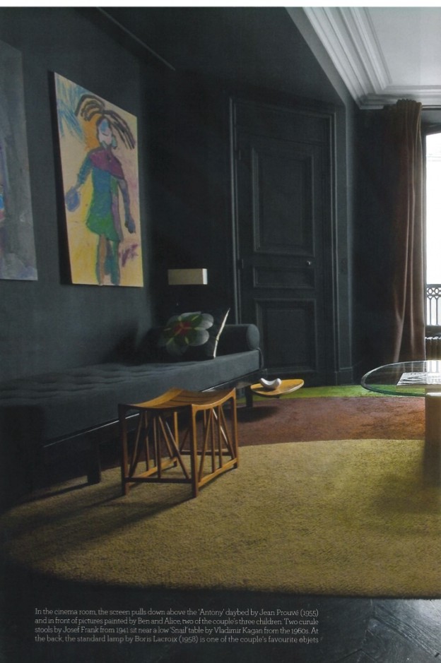
Lopez has a very particular 20th-century aesthetic. The inspiration for this interior comes from Le Corbusier’s Villa Savoye, which explains the ‘graphic rigour’ within. The parquet floors have been painted black throughout, which create cohesion with the dark slate terrace outside. Walls are painted matt in chalk-white or various shades of blue. Blue prevails, also as an upholstery colour – armchairs in the entrance area are covered in four different shades of deep blue, for example. Otherwise, black, white and the odd shot of vivid yellow provide the contrast. A sleek, wall-hung granite washbasin and copper and brass accessories add an element of luxe.

florence lopez7WOI-ohl.florence lopez4WOI-ohl.florence lopez1WOI-ohlflorence lopez3WOI-ohl.florence lopez5WOI-ohl.

Furniture includes a daybed by Jean Prouve, pieces by Josef Frank, Alvar Aalto and Robin Day.

It’s quite a rigorous, purist approach, stripping back all signs of classical detail and extraneous elements, but I think it’s hugely successful. What do you prefer, classical elements or clean modern lines?

20th Century Fox, World of Interiors, February 2014. Scans by owl’s house london.

More wonderful spaces, here

house in noto.

I’ve always been an Italophile but last year was the first time I had visited Sicily. Having been seduced by the superior piece of writing Il Gattopardo (‘The Leopard’), and the rather lighter, but no less charming stories of Inspector Montelbano, it was raw and intense and wonderful. This house is in Noto, a jewel of a Baroque town on the east coast (we stayed just outside Noto, in this fabulous hotel).

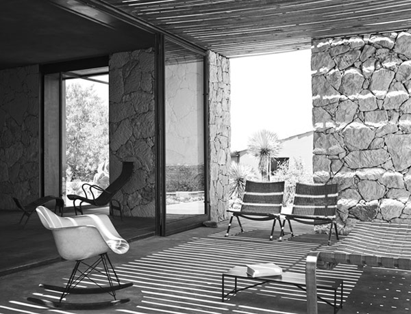
White stone walls that look as if they have been laid dry are juxtaposed with surfaces of smooth render. Other hard surfaces – concrete floors and full height metal framed openings – help to achieve the feeling of respite from the hot sun. Mid-century furniture languishes in the cool interior –  Bertoia walnut bench; Alvar Aalto tables and PH5 pendant (more PH5, here); beautiful, sculptural moulded plywood armchairs.

gordonguillaumier1Noto_03Noto_10gordonguillaumier3gordonguillaumier10Noto_13Have you visited Sicily? Casa Eloro by Gordon Guillaumier (also worth a look: Casa Muro, also in Noto, here)

More wonderful spaces, here

a neutral palette.

A development of five apartments in Melbourne caught my eye whilst scouring the internet, as did the design blog of its author, pages from my moleskine (well worth a peek, here). Although undecorated and uninhabited, a bland developer’s palette has been avoided with rich, subtle texture and beautifully detailed finishes. French grey parquetry flooring, palest timber veneer panelling and honed limestone provide the neutral backdrop. Generous proportions are evident with full height doors, and weighty stone benchtops. Plate sized, bespoke turned timber handles are the only extraneous elements. The black shutters of the facade create the only pattern within – that of the sunlight striping across the floor.

The otherwise achromatic colour scheme is only broken in the Powder room, with rich, grey/green mosaic tiles, and a single Alvar Aalto-designed A330 brass pendant floating assymetrically in the space. I love this palette of materials most of all.

CJA_Washington_015CJA_Washington_017CJA_Washington_013CJA_Washington_016CJA_Washington_023CJA_Washington_002

Gorgeous photographs by Derek Swalwell give life to the otherwise vacant spaces.

Could you live here? Toorak apartments, Melbourne by Chamberlain Javens Architects, via

More wonderful spaces, here.

old, iconic and new :: a stool and a light.

Having grown up in Australia, I made my first acquaintance with the Moomins rather later than my Swedish/Finnish counterparts. Enchanted still, I love the expressive, stylised images and beautiful linework of Tove Jansson’s illustrations, not to mention the characters themselves. Alvar Aalto stools are the archetypal stool (I have two, and they won’t be my last). Finnish brand Artek is releasing four pieces from the Aalto collection with Moomin characters lolloping across the face. Table 90B, Stool 60, Children’s Stool NE60 and Children’s chair N65 are all participating.  More Artek re-releases from an earlier post, here. More from Artek, here.

artek_moomins_four-ohl

Another exciting re-issue, Louis Poulsen’s wonderful, iconic PH5 (I wrote about a perfect pendant, here) has been released with new colour combinations, including coconut white, army green/dark grey, dark grey/turquoise and wasabi green. The spacers which hold the shades in position are finished in bronze, and they are all a soft, matt finish.

poulsen_artek_four-ohl

I love the soft coconut white-on-white, and the dark grey/turquoise; what about you? More, here.

Also love this round-up of five modern design icons in Dwell, including Eero Aarnio and Lina Bo Bardi, here.

a perfect pendant.

mid-century-modern-pendant-light-4

Often referred to as the Hand Grenade, A110 ceiling lamp was designed by Alvar Aalto for the building of the Finnish Engineers’ Association in 1952. It mixes midcentury with minimalism (how perfect!) – two cylinders, one inside the other, with a gap so the light is reflected upwards, and a perforated brass ring at the bottom diffuses the light downwards. Made of lacquered aluminium with a polished brass ring, the lamp looks fabulous hung individually or in a group.

A new version has been added with a slight reworking and a new colour combination of white and yellow or black and red: Special Edition A110 lamp designed by Mike Meiré. He was also responsible for the special edition Stool 60 (here). The white version represents day and the black version represents night.

How perfect is that?

a110

1 + 2    Original A110 lamp

3 + 4    Special Edition A110 lamp

Manufactured by Artek. You can get one, here. Feature image via

More found objects, here

stool 60 turns 80.

This stool is about as good as it gets. An iconic form – simple, practical, stackable, durable. I have two at home and I use them as bedside tables… and something to stand on if I need to reach beyond tip toes. A perfect little piece of design.

The story started 80 years ago when Finnish architect and designer Alvar Aalto tested the sturdiness of his three-legged stool by repeatedly throwing the prototype to the floor at the Korhonen furniture factory. The simple wooden stool represented a new approach to furniture design, and a continuation of the brand of modernism initiated by Bauhaus. The use of wood instead of tubular steel was revolutionary at the time. Aalto had spent several years working on the stool’s design and the development of its curved, L-shaped legs.

Stool 60 was first introduced to the international public at the Wood Only exhibition in London in 1933, to rave reviews.

The stool celebrates its 80th birthday with two special editions:

aalto colours

The colours of the Stool 60 Anniversary Edition are taken directly from Aalto’s Paimio Sanatorium (1928–1933): the yellow of the floors, the green of the walls, the turquoise of the handrails and walls, and the orange, white and black of the furniture. The Paimio Sanatorium is considered to be the most important functionalist building by Aalto.

special edition artek

And German artist Mike Meiré’s Special Edition features four different colour ways – a red, black, white and birch stool, recalling the Bauhaus movement. A more industrial approach with sulphur yellow added to the black, white and birch. The third colour way is birch, white and light pink. The fourth is minty turquoise with birch and black.

Which would you choose? You can get one (or two…), here

All images, artek

More found objects, here