Burn Down chart vs Burn up Chart in the project management
Whether you are PMP or ACP aspirants- One of the hottest topics you must be clear about is Burndown VS Burn up charts.
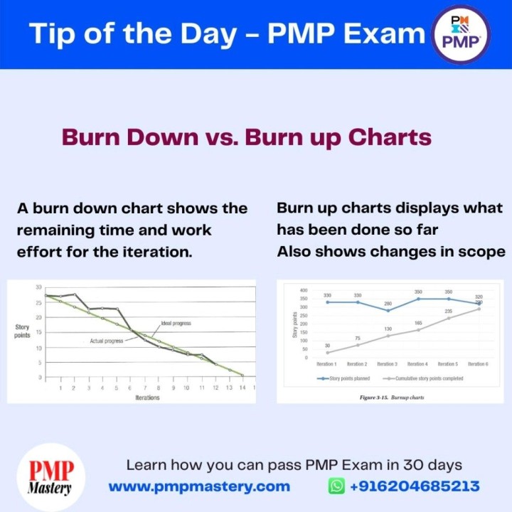
there are two types of Burn charts - Burndown and Burnup Charts
A burndown chart is a line chart, updated daily, that tracks the amount of work left on the project, “burning” down to zero when the work is done. while Burn up chart is the opposite of it- showing completed work in the project- what has been done so far.
While the burn-down chart moves in the downward direction and burn-up charts in an upward direction- as more and more stories are completed and delivered to the end-user.
The one advantage of burn-up charts over burn-down charts is that they can show changes in scope, making the impact of those changes visible.
So in nutshell, both charts are very powerful tools and can be used for tracking team progress as well as project progress. However, its project team to determine which one or both charts they want to use in the project.
if you are PMP Aspirants then join our free regular PMP Mock session and get the most benefit out of it.
Also, you may visit our website: www.growacto.com
For any help you May write to us: info@growacto.com
PMI #pmiacp #project #pmpmastery #pmpexam #professional #projectmanager #pmpmentorship #pmpquestions #pmptips #projectmanagement #pmptraining #userstory #storypoints #pmpmastery #epics #burndownchart #burnupchart