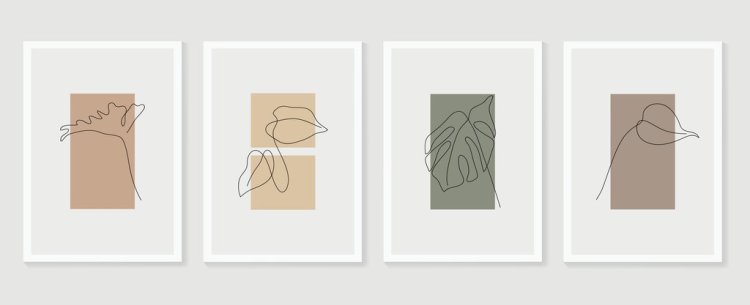
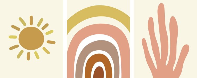
Brightly-colored illustrations take a break as minimalism draws in the general public. Discover why this is not a coincidence.
The first social media website—Six Degrees—was born in 1997. But Friendster, in 2002, is probably one of the most-remembered. A year later, Myspace surfaced, which had 25 million users by 2005. We’re really into sharing parts of our lives and meeting new people in the digital space. Today, however, there’s just too much noise on social media. So, there’s no question why brands and individuals building creative careers lean on minimalism for their digital presence.

In logos, social media posts, color palettes, blogs, and website imagery, we become more and more attracted to the simple, the bare minimum. This is no coincidence. Advertisements and digital media have bombarded us with brightly-colored illustrations, flashing images, and neon lights, which are still interesting, for sure. It’s just that unconsciously (or consciously), people are now choosing more modest illustrations.
Where Did the Minimalism Design Trend Come From?

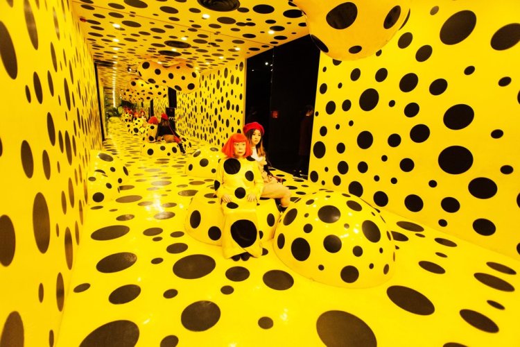
Minimalism started to emerge sometime in the late 1950s. Back then, it was considered a “boundary-pushing art movement” that showcases the simplicity of things. It focuses on clean lines and neutral color palettes, which was a fresh sighting in the 1950’s. Frank Stella, Donald Judd, and Yayoi Kusama were among the first artists who really showed the world what minimalism looks like. While their works are in bright colors, the illustration and lines were at their simplest.
Too Much Design Is Just Too Much

Fast forward to today, so many brands are adapting to the minimalism trend. Take a look at the logo of MasterCard, Apple, Beats, Airbnb—all are distinct and minimal.
A logo has so much responsibility. Aside from the rule of thumb that it should represent your brand accurately, logos should also captivate the audience and be easy to remember. It sounds plain and simple, but that’s not easy to create. The same concept applies to illustrations used in blogs and articles—especially the header images. People are hard-wired to be visual, to be attracted to images, but it can be too much.
We All Seek Quiet—Consciously or Unconsciously

As a result of being part of the crowded digital landscape for an extremely long time, we’re now seeking the quiet. Designers, photographers, and illustrators are encouraged to produce more work in this style because of the high demand. As in, people like minimalism, but also, they want something new. Something fresh. Something where the negative space becomes positive. The general public is drawn to brands that distinguish themselves by choosing simple color schemes and lowkey illustrations as they begin to relate to the visual modesty of minimalism.
Colors, the Vibes They Give Off, and Consumer Purchases
Alongside the simplicity in illustration, minimalism is also about simplicity in color. Think pastel shades, monochrome, and black and white. Color affects our mood, so it’s no coincidence that so many brands utilize red in their logo. Red is not only attractive, it’s also associated with warmth and a sense of urgency, encouraging people to make that purchase. But, people also associate red with anger, which is to say, colors can have opposing vibes.

Neutral tones feature in minimalist designs for good reason. Earth tones give off a calming vibe, while black and white is straightforward simple. It’s also advisable to explore undertones of various shades and colors when working on new illustrations. And, going for monochrome, or focusing on one color with varying shades, is a wise move to cut down the visual noise and give people what they’re looking for—something that feels calm and relaxing.
Minimalism Is a Breath of Fresh Air

If there’s one thing for sure, minimalism is a breath of fresh air. Minimalist illustrations have been around for decades. But, in the digital world, where so many new brands and businesses surface every year, stripped-down designs remain influential.
As for illustrators catering to the visual element needs of these brands, the demand for captivating minimalist work is at a high. Selling your work through stock photography sites is only one of the many avenues for you to easily reach brands from across the globe.
There’s no prediction when people will move on from minimalism. But, for now, there’s a need for new ideas and fresh imagery. There’s always the need to challenge yourself as an artist to push boundaries and explore simplistic designs that will elevate a brand’s online presence.
For more minimalism inspiration:
Cover image via sini4ka.


